By Sagar Waghmare
Introduction
Creating pixel perfect UI is tricky on Android since there are a lot of different screen sizes and resolutions to support. Android developers need to support different screen densities/sizes but the UX team most likely delivers pixel perfect UI designed for iPhones. This article is useful to Android UI developers who already know basic UI development and are aware of the basic Android support (see https://developer.android.com/training/basics/supporting-devices/index.html). While the SDK documentation describes how to manage UI for different screen sizes (like phone and tablet and devices with different screen densities), this document offers a more practical approach and deals with devices that have the same screen density, but still have different screen sizes.
Problems creating pixel perfect UI in Android
Since Android supports lots of devices with variable screen sizes the problem starts right from the UX design phase. The UX guys are not sure how to create a UX design spec that will cover all the screen sizes. So, they either create specs for iOS with all the details marked in pixels and points and ask the Android developers to follow the specs. OR they will pick a Android screen (say of Nexus 5), create the spec for this device with pixels and points and will ask the Android developers to create UI which matches for all other screens.
For Android developers it is more difficult task, first they have to interpret the iOS/Android specs to Android, translating all the pixels values to dp values OR sometimes percentage of screen, translate pt values to sp and so on.
Now let's try to fix the problem by looking at an example.
Example 1: When the screen has horizontal constraint to be fixed. The screen can scroll vertically
Below is an example of the specs provided by an UX designer.
Here is an iOS screen spec provided with all the measurements specified in pixels and all the text sizes specified in points. In Android we need to convert this pixels to dp and points to sp.
 Here are the tips/steps on how we can create pixel perfect UI for Android even with iOS specs.
Tip 1: Have some knowledge on the iOS/Android available screen sizes
Now since the specs provided for us can be of iOS/Android, we should have some knowledge on the iOS/Android available screen sizes. So that, when we get the specs for a screen, we know which screen size the UX designer is using for creating UX specs. This is useful for deciding the sizes of the views in Android. In our example, the UX designer has used iOS 5 with screen size 640px x 1136px.
Step 1: Decide which Views can be fixed size and which Views cannot be fixed
In most of the cases the app screen has to be fixed horizontally while it can scroll vertically (if there is content which doesn't fit in the available height). So for such cases where we do not have any constraint on the height, we need to make the horizontal UI pixel perfect as far as possible. Now, from the above iOS specs, we can see that the ImageView (which shows the chrome icon) needs to be fixed size (width and height). This Image takes around 85% of the available screen width. The Text and Button Views are to be fixed in width and can be variable at their height. They will take the vertical space as much as they want.
Step 2: Set the View sizes/margins in the Android app
Setting the View sizes/margins can be done using 2 approaches:
Approach 1: Setting the View sizes programmatically
By using this approach we will calculate the sizes of the Views programmatically at runtime and set them. In our example, we can see that the Image actually occupies around 88% of the total width. So, we will calculate the expected image width for the current device screen width and set this new size to the ImageView. Also calculate the margins between these views and set that as well.
Define the Image to the Screen ratio:
// The Image uses 88% of the screen width
private static final float IMAGE_SCREEN_WIDTH_RATIO = 0.88f;
Calculate the ImageView size and Margins:
// Get the actual screen width
int screenWidth = getScreenWidth();
// Calculate the new image size
int imageViewSize = (int) ((float) screenWidth * IMAGE_SCREEN_WIDTH_RATIO);
// Calculate the margin
int margin = (screenWidth - imageViewSize) / 2;
Set this new size to the ImageView and TextViews before the UI is rendered:
// Set the Image size
LinearLayout.LayoutParams params = (LayoutParams) mImageView.getLayoutParams();
// Setting the same size for Width and height
params.height = imageViewSize;
params.width = imageViewSize;
// Set the margin's
params.topMargin = margin;
params.bottomMargin = margin;
mImageView.requestLayout();
// Set the Header Tv margin
params = (LayoutParams) mHeaderTv.getLayoutParams();
params.bottomMargin = margin;
mHeaderTv.requestLayout();
// Set the Sub Header Tv margin
params = (LayoutParams) mSubHeaderTv.getLayoutParams();
params.bottomMargin = margin;
mSubHeaderTv.requestLayout();
int marginBetweenBtns = margin / 2;
// Set the Cancel Btn margin
params = (LayoutParams) mCancelBtn.getLayoutParams();
params.rightMargin = marginBetweenBtns;
mCancelBtn.requestLayout();
// Set the Send Btn margin
params = (LayoutParams) mSendBtn.getLayoutParams();
params.leftMargin = marginBetweenBtns;
mSendBtn.requestLayout();
Here is the XML definition for this layout:
<ScrollView xmlns:android="http://schemas.android.com/apk/res/android"
xmlns:tools="http://schemas.android.com/tools"
android:layout_width="match_parent"
android:layout_height="match_parent"
android:background="#aaaaaa" >
<LinearLayout
android:id="@+id/screen_container"
android:layout_width="wrap_content"
android:layout_height="wrap_content"
android:layout_gravity="center_horizontal"
android:orientation="vertical" >
<ImageView
android:id="@+id/image_view"
android:layout_width="match_parent"
android:layout_height="match_parent"
android:background="@drawable/chrome_icon" />
<TextView
android:id="@+id/header_text"
android:layout_width="match_parent"
android:layout_height="wrap_content"
android:text="Header fontsize - 25"
android:textSize="25sp" />
<TextView
android:id="@+id/subheader_text"
android:layout_width="match_parent"
android:layout_height="wrap_content"
android:text="Text fontsize - 17"
android:textSize="17sp" />
<LinearLayout
android:id="@+id/button_container"
android:layout_width="match_parent"
android:layout_height="wrap_content"
android:orientation="horizontal" >
<Button
android:id="@+id/cancel_btn"
android:layout_width="0dp"
android:layout_height="wrap_content"
android:layout_weight="1"
android:background="#ffffffff"
android:text="Cancel"
android:textColor="#007Aff"
android:textSize="15sp" />
<Button
android:id="@+id/send_btn"
android:layout_width="0dp"
android:layout_height="wrap_content"
android:layout_weight="1"
android:background="#ffffffff"
android:text="Send"
android:textColor="#007Aff"
android:textSize="15sp" />
</LinearLayout>
</LinearLayout>
</ScrollView>
Here is the screen shot of the same UX design on Android using this approach:
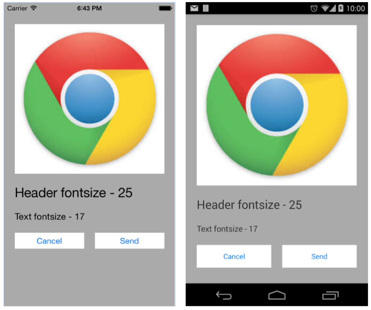
The advantage of using this approach is that the UI will look consitent across all the devices. It will consume the same percentage of screen on all the devices. But to achieve this, we need to relayout the Views when the new sizes are computed.
Approach 2: Using predefined values for margins/padding etc
In our example, the iOS specs specifies the margins to be 40px. Now, for Android we can use a predefined formula for calculating the dp values. For example, in our case we can use the formula 1dp=2px. (This formula has to be decided by the developers based on some trial and error methods, depending on which formula fits best for our need). So when the specs specify as 40px, we will set the value as 20dp and so on. This approach is simpler than the earlier approach, since, for most of the places we need to set the value at compile time and that too in the XML layout file.
Here is the XML definition for this layout:
<ScrollView xmlns:android="http://schemas.android.com/apk/res/android"
xmlns:tools="http://schemas.android.com/tools"
android:layout_width="match_parent"
android:layout_height="match_parent"
android:background="#aaaaaa" >
<LinearLayout
android:id="@+id/screen_container"
android:layout_width="wrap_content"
android:layout_height="wrap_content"
android:layout_gravity="center_horizontal"
android:orientation="vertical" >
<ImageView
android:id="@+id/image_view"
android:layout_width="match_parent"
android:layout_height="match_parent"
android:layout_marginBottom="20dp"
android:layout_marginTop="20dp"
android:background="@drawable/chrome_icon" />
<TextView
android:id="@+id/header_text"
android:layout_width="match_parent"
android:layout_height="wrap_content"
android:layout_marginBottom="20dp"
android:text="Header fontsize - 25"
android:textSize="25sp" />
<TextView
android:id="@+id/subheader_text"
android:layout_width="match_parent"
android:layout_height="wrap_content"
android:layout_marginBottom="20dp"
android:text="Text fontsize - 17"
android:textSize="17sp" />
<LinearLayout
android:id="@+id/button_container"
android:layout_width="match_parent"
android:layout_height="wrap_content"
android:orientation="horizontal" >
<Button
android:id="@+id/cancel_btn"
android:layout_width="0dp"
android:layout_height="wrap_content"
android:layout_marginRight="10dp"
android:layout_weight="1"
android:background="#ffffffff"
android:text="Cancel"
android:textColor="#007Aff"
android:textSize="15sp" />
<Button
android:id="@+id/send_btn"
android:layout_width="0dp"
android:layout_height="wrap_content"
android:layout_marginLeft="10dp"
android:layout_weight="1"
android:background="#ffffffff"
android:text="Send"
android:textColor="#007Aff"
android:textSize="15sp" />
</LinearLayout>
</LinearLayout>
</ScrollView>
Even using this approach is not sufficient for our design, so we need to set the ImageView size programmatically as done earlier.
Here is the screen shot of the same UX design on Android using this approach:
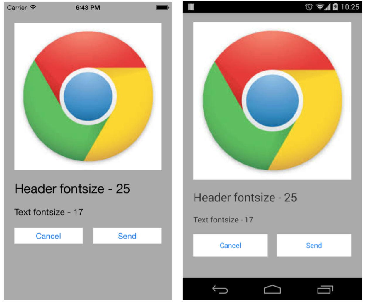
The advantage of using this approach is that the implementation is quiet simple, but the disadvantagr is that the UI will look bit different on various screen sizes based on its pixel density.
The best way to manage UI for different screen sizes is to use both the above approaches wherever required. For screens, which don't have much images and have TextView's use the XML approach and on screens which have ImageView's use the programmatic approach.
Step 3: Set the TextView text size
When specifying text size for Android Views, it is recommended to specify it in sp (scaled pixels). When we use sp, the android system takes care of scaling the text size appropriately based on the device and based on the user preference of Text Size setting. But when we get the specs, it is possible that the specs mention the text size in points (pt) i.e in the iOS style.
For Android, the general formula for pt to sp conversion is 1sp = 1pt. But this too depends on the font we use. So, if for some font using 1sp = 1pt formula looks too small, we can use the formula like (n sp = n + 1pt).
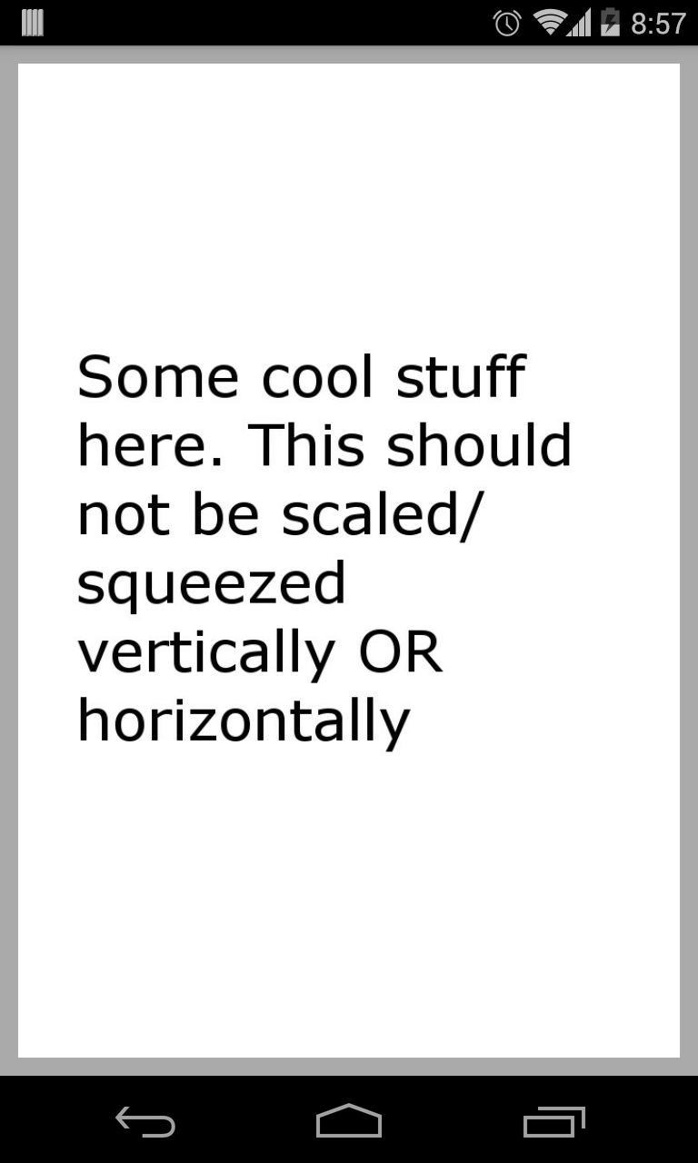
Example 2: When the screen has both horizontal and vertical constraint to be fixed
Here is an example of a screen that needs to be designed. This specs specifies that the cool-stuff shown in the center of the screen (with white background), should always be properly shown. It should not be scaled/squeezed from and side. While it also specifies that we need to maintain a minimum margin of 40px.
 Creating pixel perfect UI when both the width and height are fixed is more complex and tricky. Every screen has different solutions, but follow the same below approach.
Approach: Setting the View sizes programmatically
By using this approach we will calculate the sizes of the Views programmatically at runtime and set them. In our example, we can see that the cool-stuff needs to be present in the center of the screen and that too cannot scale or squeeze. So, this is what we will do:
- Get the cool-content size shown in the spec. We will need it to resize the cool-content stuff on the screen keeping its aspect ratio same.
- Get the space available on screen to layout our cool-stuff. This is done by using OnPreDrawListener.
- Calculate the maximum size we can set on the cool-stuff content and set it.
Define the Cool-Stuff Content ratio:
// The Cool-Stuff content ratio
private static final float COOL_CONTENT_DIMENS = 688f / 1056f;
In the XML definition, add a parent View to our cool-stuff content which will give us our available size.
In the below XML code, screen_container is the parent to our cool-stuff view layout. Here we make sure that the cool-stuff content is initially gone and will make it visible when the correct height is set. This will make sure that the UI won't flicker when the size changes.
<RelativeLayout xmlns:android="http://schemas.android.com/apk/res/android"
xmlns:tools="http://schemas.android.com/tools"
android:layout_width="match_parent"
android:layout_height="match_parent"
android:background="#aaaaaa"
android:padding="10dp" >
<RelativeLayout
android:id="@+id/screen_container"
android:layout_width="match_parent"
android:layout_height="match_parent" >
<LinearLayout
android:id="@+id/cool_content_layout"
android:layout_width="match_parent"
android:layout_height="match_parent"
android:layout_centerInParent="true"
android:background="@drawable/cool_content"
android:orientation="vertical"
android:visibility="gone" >
</LinearLayout>
</RelativeLayout>
</RelativeLayout>
Get the space available on the screen for the cool-content
mScreenContainer.getViewTreeObserver().addOnPreDrawListener(new OnPreDrawListener() {
@Override
public boolean onPreDraw() {
// Available height for cool-stuff
int height = mScreenContainer.getHeight();
if (height > 0) {
// Available Width for cool-stuff
int width = mScreenContainer.getWidth();
computeCoolContentDimens(width, height);
// Don't forget to remove the PreDrawListener
mScreenContainer.getViewTreeObserver().removeOnPreDrawListener(this);
}
return true;
}
});
When we get the screen size available for our cool-content, we compute the size of the cool-stuff layout.
Compute the size of the cool-content based on the available size
If we scale the cool-content width, it is still possible that the new scaled height goes beyond the available size. So, we need to first scale the width, check if the height is still in the limits. If yes, set the size. But if the height doesn't fit in the limits, scale the height of the cool-content based on the available height. This is how it can be done.
// Try to match the cool stuff to the available width first
int coolStuffHeight = (int) ((float) availableWidth / COOL_CONTENT_DIMENS);
// If the new height is within the available screen height, set it
if (coolStuffHeight <= availableHeight) {
setCoolContentDimens(availableWidth, coolStuffHeight);
}
// If not, calculate the new cool width, this will have width surely
// less then available width
else {
int coolStuffWidth = (int) ((float) availableHeight * COOL_CONTENT_DIMENS);
setCoolContentDimens(coolStuffWidth, availableHeight);
}
Set the size of the cool-content based on the computed size
Before setting the size we will make the view visible and then will set the size using the layout params.
mCoolContentView.setVisibility(View.VISIBLE);
RelativeLayout.LayoutParams params = (LayoutParams) mCoolContentView.getLayoutParams();
params.width = width;
params.height = height;
mCoolContentView.requestLayout();
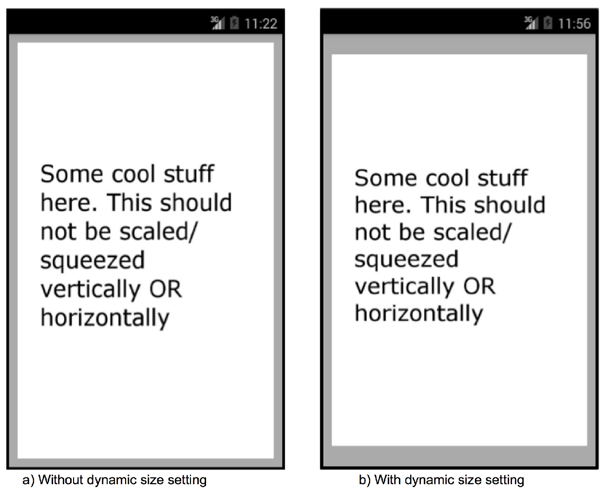
The below screenshots are taken from a Nexus S device. Fig a. shows the UI rendered without and dynamic computations. We can clearly see that the text is stretched. While Fig b. shows the approach of dynamic size calculation.